Rakuten Unveils Bespoke Typeface With 4 Unique Styles To Unify Its Massive Brand
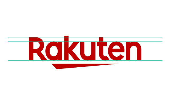
Image via Rakuten
Rakuten has teamed up with London Type design studio Dalton Maag to create a unified typeface for its company.
Rakuten is a huge Tokyo-based ecommerce company and the country’s largest internet bank, but up till recently, it did not have a typeface that linked all its services.
The company developed its own typeface back in 2012. However, it was designed before the company had grown to a huge scale.
Dalton Maag told It’s Nice That that the former typeface had a “distinct personality and served them well,” but its main focus was on the logo and title usage. The design studio was commissioned to create a large type system of four different styles to cater to the different business needs.
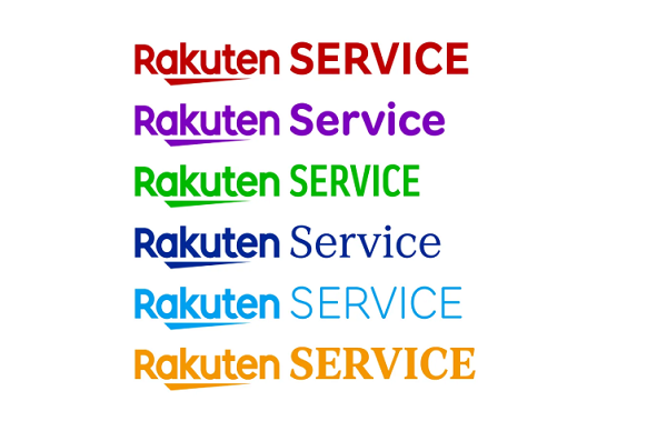
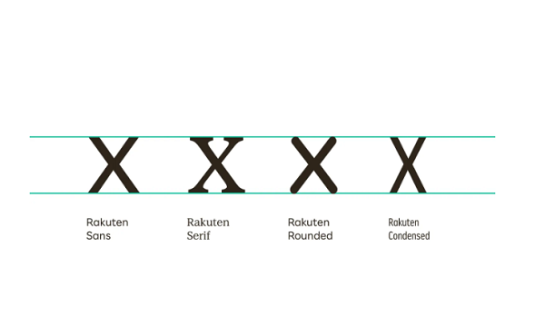
The result is the ‘Rakuten Font’, branching into ‘Rakuten Sans’, ‘Serif’, ‘Rounded’ and Condensed’. Rakuten described its ‘Sans’, used for the brand’s identity, as “welcoming and accessible default,” ‘Serif’ is to express elegance,” ‘Rounded’ for “fun and playful,” while ‘Condensed’ is “bold and impactful.”
Although they have distinct differences, the styles still feel familiar due to the concept of Ichi, which means one—a part of the brand’s ethos.
The new identity is described as “clear and functional,” with “the right tone of voice to support the distinct personality of the brand.”
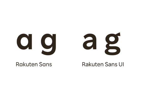
The typeface also adapts to the company’s future plans for development. “In the Sans, the terminals of the round strokes of letters like ‘c’ have a clight faring and are cut to a particular triangle, which results in a crisp, sharp texture,” the design team explained. “This style is complemented by a ‘true italic’, rather than a simple oblique, making a lively organic voice available to the brand.”
The agency worked together with Rakuten’s chief creative officer Kashiwa Sato and the company’s Design Lab to create the typeface. The team also organized an in-person workshop to get a clear brief and better understand how the typeface would be utilized. They agreed on a “geometric sans serif style” that would “act as a cornerstone for the brand” while retaining Rakuten’s typographic heritage.
The workshop also led to the creation of the four styles with five weights each to suit each of the services’ unique audience. “Our new font family gives us a variety of choices to best represent each service,” Rakuten Design Lab told It’s Nice That.
Rakuten’s main logo remains the same, but the design team used the new typeface to typeset each sub-brand logo. The studio designed a set of smaller capitals to be used in logo designs in long form reading. “Single-storey letter constructions help harmonize with the Rakuten logo, while double storey versions enhance legibility in UI settings,” the studio explained.
We worked with @DaltonMaag, a London-based typeface design studio, to create a family of four custom-made #typefaces especially for Rakuten. https://t.co/gKs3wfDYu0
— Rakuten Today (@RakutenToday) August 10, 2020
[via It’s Nice That, opening image via Rakuten]
Also check out these recent news


