Shakespeare’s Globe Introduces Typeface Featuring Designs From His Seminal Works
To welcome a new season, Shakespeare’s Globe debuted its new typeface—featuring digitally-enhanced versions of the woodcut illustrations from the famed playwright’s First Folio.
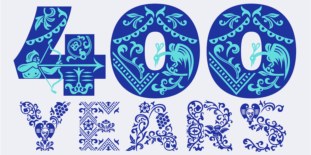
The designs, developed in collaboration with design studio Typeland, mark the 400th anniversary of the First Folio, otherwise known as the most famous collection of Shakespeare’s works, which was first printed seven years after the bard’s death.
Within the collection are iconic plays, including The Tempest, Comedy of Errors, and Macbeth, all of which could have been lost to time if the volume was never compiled.
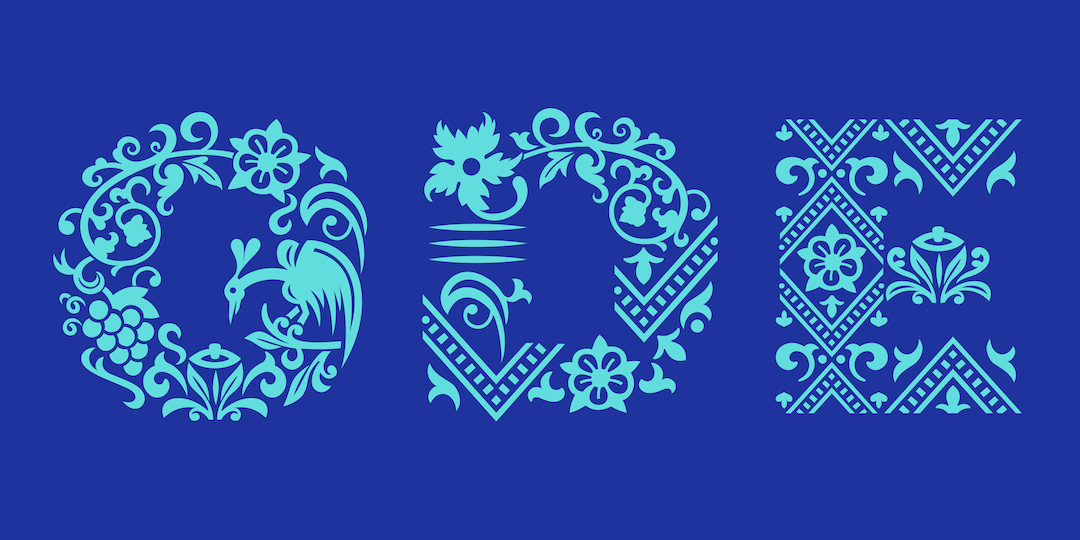
Tapping on the previous Amifer typeface designed by Typeland, the updated version of the fonts incorporates illustrated elements from the collection. The typeface showcases the theme of summer through elements from nature, “addressing ideas of flourishing and decay as well as the cycles of regeneration and the restoration of balance.”
According to Design Week, there exists a long tradition of ornamented letterforms, in particular Louis John Pochée’s Pochée alphabet. This style of typeface uses fat-face lettering together with detailed illustrations—ranging from fruit, flowers, and wildlife to musical instruments and Masonic symbols.
This time, Typeland focused on the motifs found in the First Folio and was tasked to interpret the imagery from the historical document “in a clean and contemporary manner” to merge the “peculiar elements of the Folio’s woodcuts” with other elements from nature.
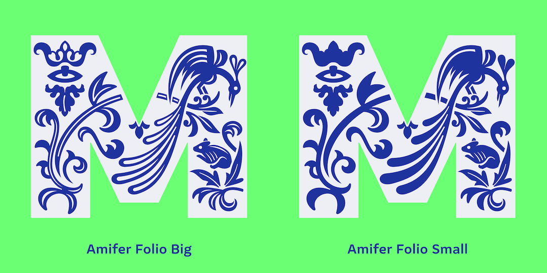
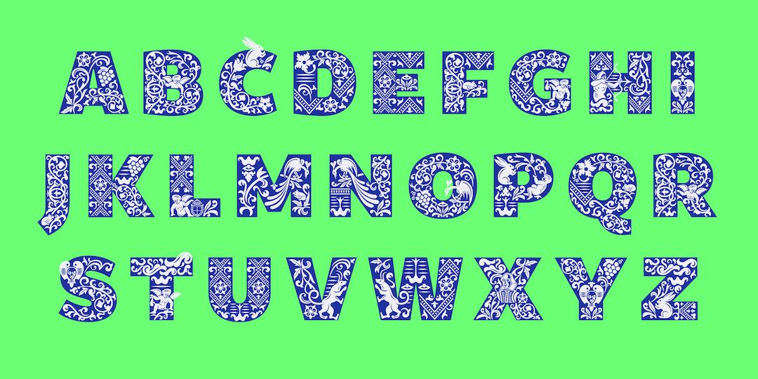
As per It’s Nice That, the resulting typeface makes use of an entirely uppercase alphabet, though there are two separate versions—a simplified Amifer Folio Small and Amifer Folio Big, which features more motifs to provide a greater visual impact “at larger sizes.”
Imagery from the First Folio can be seen throughout the letters, with a “cast of characters” said to feature in each style, including angelic and demonic depictions, gargoyles, and other motifs taken from the woodcuts found in the volume.
Additionally, the illustrations from the tome had to fit different letter shapes, with the elements on these letters needing to match the mood of various plays. For example, the letter M comes in two iterations. One features a shooting arrow through it for A Midsummer Night’s Dream, while the other has a regal bird for Macbeth.
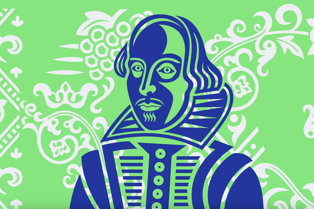
To round up the typeface, the team created a special Shakespeare glyph with the likeness of the playwright himself.
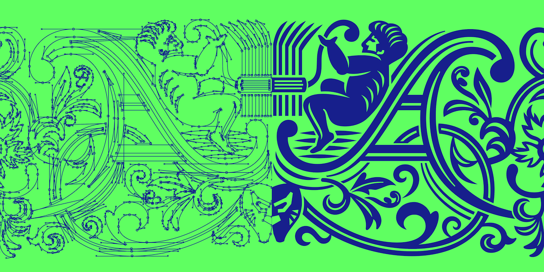
Image via Typeland
[via It’s Nice That and Design Week, images via Typeland]


