
PANTONE’s New ‘Color Insider’ Tool Helps You Connect The Dots With Trends
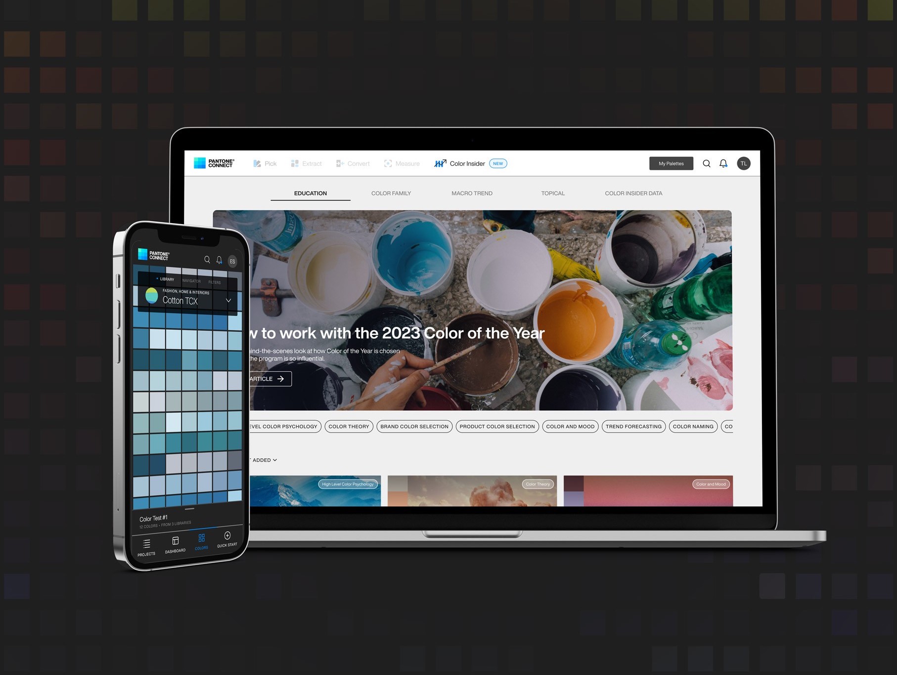
Image courtesy of PANTONE
PANTONE’s latest offering is painting the town a trendy, time-relevant red—and every other shade imaginable.
With design trends shifting faster than a chameleon in a rainbow, creatives are under increasing pressure to capture the zeitgeist to resonate with consumers. Enter color—the unsung hero of brand recognition and purchasing decisions. Having grasped color’s role in design, PANTONE is keeping designers in the loop with the new Color Insider service, a palette-pleasing addition to the PANTONE Connect platform.
Color Insider aims to be a go-to resource for designers hungry for chromatic inspiration. This digital platform serves up a delectable menu of color forecasts and data, catering to the global design community’s appetite for fresh, trend-setting hues.
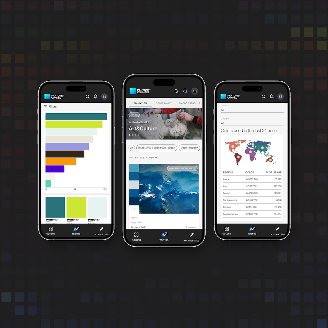
Image courtesy of PANTONE
At its heart, Color Insider is the color authority’s response to the dizzying pace of aesthetic evolution in the design world. With brands and products increasingly judged by their hues (looking at you, ‘Brat’ green), this tool provides designers with the intel they need to make informed choices from concept to completion. Rather than just helping professionals pick pretty colors, it’s about understanding the stories and significance behind them.
The service brings together the collective wisdom of the PANTONE Color Institute’s global experts, offering users a rich, contextual experience. Weekly updates keep subscribers in the know with strategic color insights, fundamental color education, and a nifty global color data tool. This last feature is particularly notable, giving designers a quantitative peek at color trends across industries and cities, and even showing what tones their peers are playing with.

Image courtesy of PANTONE
“For over 25 years the PANTONE Color Institute has been a go-to destination from brands and designers around the world looking to understand the future of color trends and how to inform their own brand and product color choices. PANTONE Color Insider gives us the opportunity to take a lot of this information and knowledge and make it accessible to our larger creative community,” explains Laurie Pressman, vice-president of the institute.
“We believe this content can be an added support for designers to understand the relationship of color to global macro trends and what consumers are looking for to help inspire their design decisions. Never has this been so important, when design is being increasingly led by color and material and less by shape and form.”
Color Insider integrates with PANTONE Connect, allowing users to translate their inspiration into actionable palettes and mood boards. While some content is available for free, premium subscriptions unlock the full spectrum of trending articles, information, and collaboration tools This tiered approach ensures that designers of all levels can benefit from the wealth of color expertise, maintaining consistency and excellence from a project's first stroke to its final flourish.
[via PANTONE, images courtesy]


