
Amazon Gives Its Smile A Facelift After 30 Years In Global Brand Refresh
Images via Koto Studio
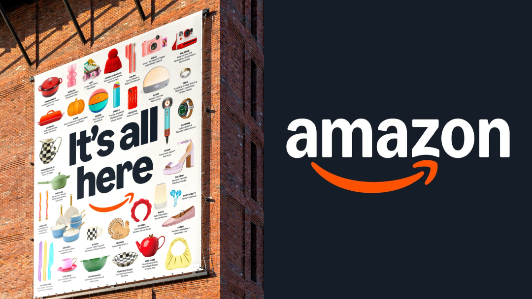
Amazon has decided it’s time to deliver a whole new look. The tech giant has completed a sweeping global brand refresh, teaming up with Koto Studio to rework its identity across 15 countries and more than 50 sub-brands.
The project, which took 18 months, tackles the brand fragmentation that emerged during Amazon’s rapid three-decade expansion. Now, whether you're ordering groceries, streaming shows, or visiting an Amazon Clinic, the experience will feel a lot more connected. Plus, a little more cheerful.
View this post on Instagram

Image via Koto Studio
Beaming through the redesign is a warmer, more prominent version of Amazon’s well-known smile. The update subtly shifts attention away from the old A-to-Z arrow, reemphasizing an aspiration to make customers’ lives easier.

Image via Koto Studio

Image via Koto Studio

Image via Koto Studio

Image via Koto Studio
To support this, Koto Studio introduced a custom typeface, Amazon Logo Sans, created for consistency across everything from mobile apps to delivery trucks.
Meanwhile, Amazon’s previous in-house typeface, Ember, has been upgraded into Ember Modern, a global-ready font supporting 364 languages and designed for clear, everyday use as well as high-impact branding.
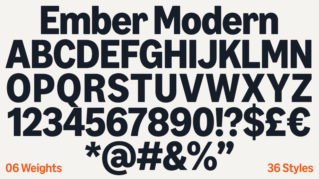
Image via Koto Studio

Image via Koto Studio

Image via Koto Studio
Amazon’s major sub-brands, too—including Prime, Alexa, and Amazon Grocery—have been reworked with tailored color palettes and adjusted typography that link back to the broader identity.

Image via Koto Studio

Image via Koto Studio

Image via Koto Studio
Prime now carries a bold, digital-forward blue; Amazon Grocery adopts a bright green; and a new system of icons inspired by the updated smile ensures visual unity across packaging, storefronts, race cars, and mobile screens.

Image via Koto Studio

Image via Koto Studio
Amazon’s trademark orange has also been fine-tuned into ‘Smile Orange’ for a more vibrant and consistent look across markets.
In addition to these design shifts, Amazon is rethinking how it groups its sprawling array of services. The updated system organizes sub-brands into clear clusters like entertainment, healthcare, devices, and grocery, creating a more intuitive structure for customers navigating Amazon’s massive ecosystem. While each sub-brand retains its own voice and style, all now connect visually under one more human-centered Amazon framework.
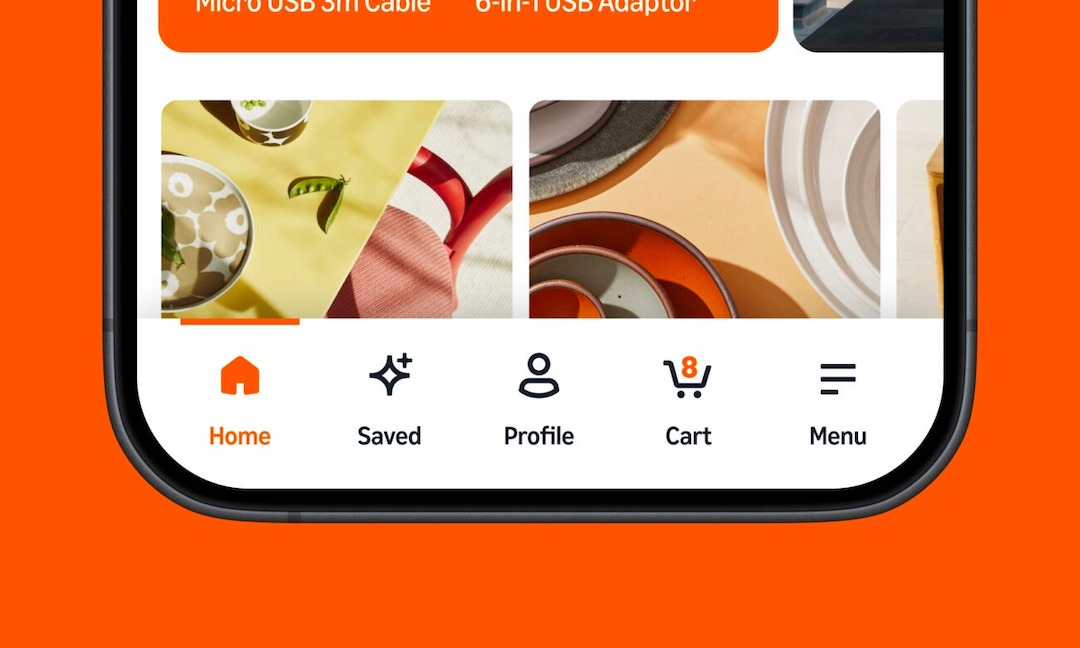
Image via Koto Studio
The facelift aims to accommodate the evolving expectations of a global customer base, stretching beyond convenience to connect.
[via Creative Review and Design Week, images via Koto Studio]


